


boys don’t cry // a zine
Boys Don’t Cry was the product of a Zine creation project during university, in a particular season where I felt compelled to explore raw themes and real people. Amidst a variety of ideas, the concept of “hearing the music that makes boys cry” was voted a crowd favorite, making me consider that maybe it was actually a topic worth exploring. So where to begin, I chose a mix of twelve vastly different men whom I asked simply one question “what song makes you cry?” The response: a mixtape combining the likes of 70s folk, contemporary Christian worship, Korean ballad’s, emo rock, and a Disney number. However, for me, the music alone wasn’t enough. Within Boys Don’t Cry, readers can explore the music that makes modern boys cry, with annotated commentary by each contributing boy along the way. Consider this your introduction course to sad boy hours, open the floodgates.
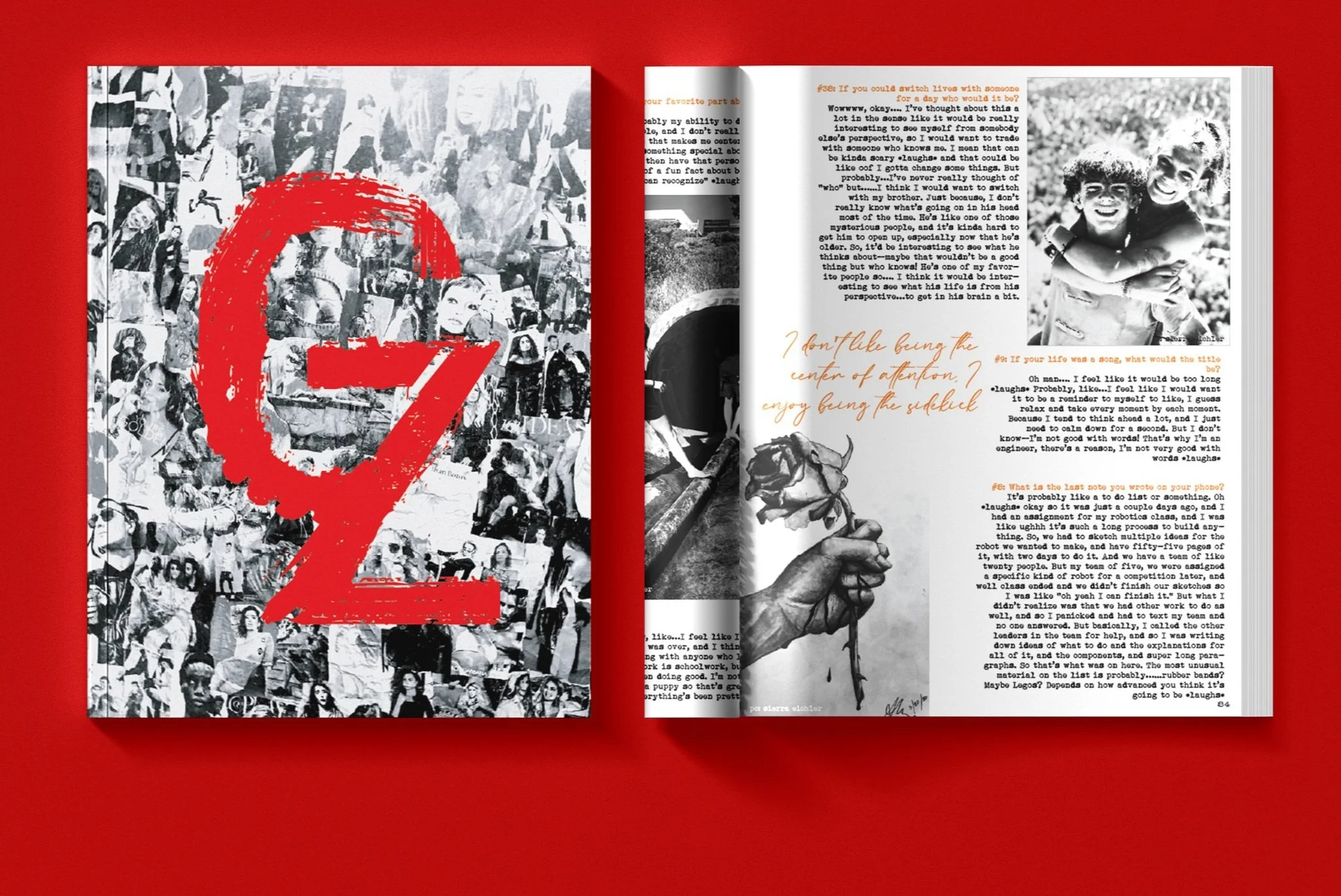
GZ // a magazine
GZ Magazine was my design capstone project, where I focused my attention on a hundred page publication exploring a variety of characters within Generation Z. The publication in total consists of thirteen individual interviews asking a series of serious (and not so serious) questions, to truly showcase the members of a particularly divisive generation, and to ask questions to see if Gen Z’ers are really as different from you and I. Alongside a printed version of the magazine, I also developed a web version translating the print material into a more accessible digital format; as well as including links to outside digital content. the intention of GZ is to make it possible for a far removed generation to feel drawn closer, and to recognize that sometimes those who appear the most different from you may actually be far more similar than given credit for.
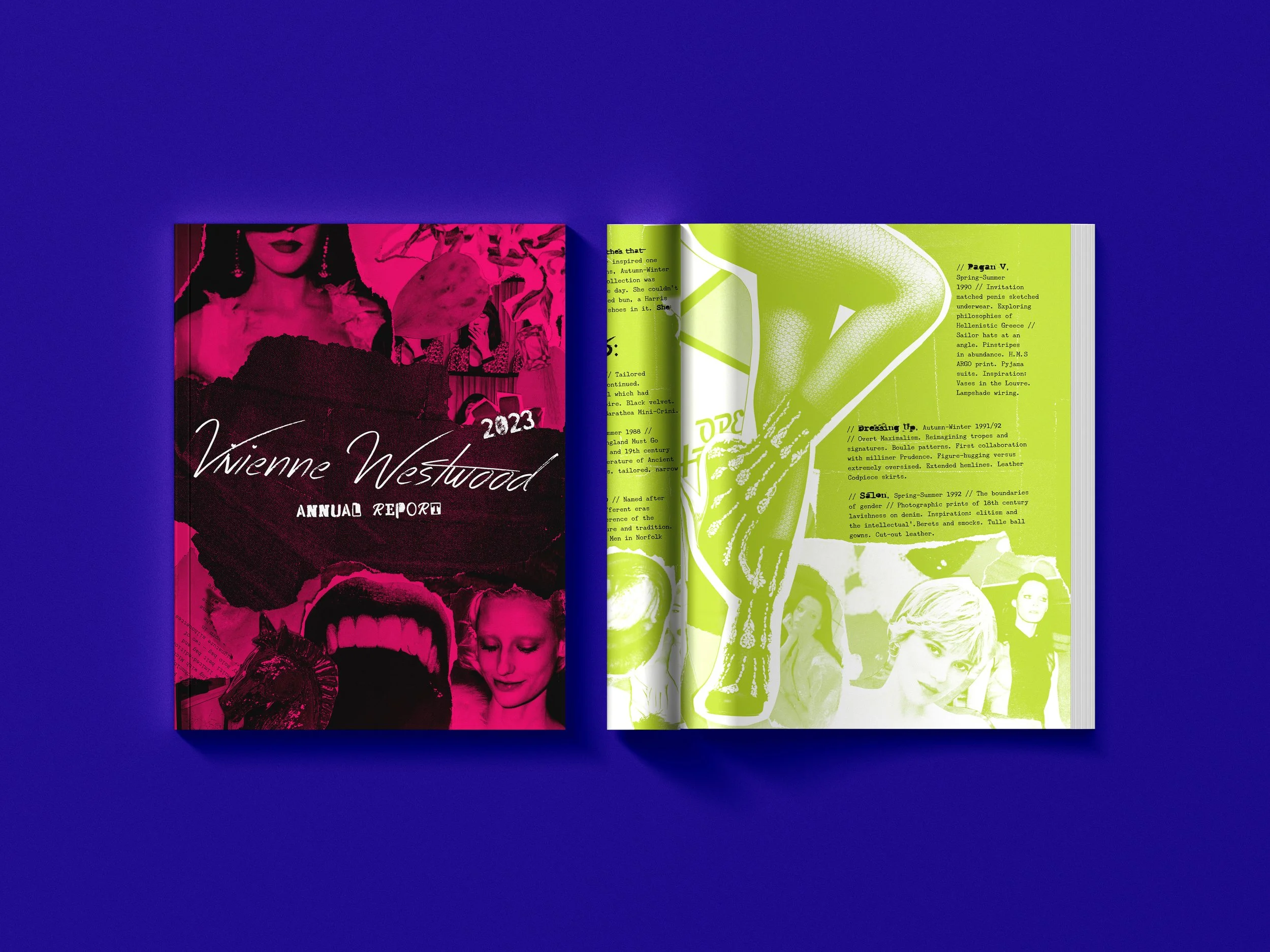
vivienne westwood //
an annual report
The Vivienne Westwood Annual Report catalog came about through an Annual Report project asking for a reimagined look into a business’s brand. Slowly turning into a time capsule of Vivienne Westwood’s greatest accomplishments and design history, the annual report is made with the intentionality and grit of every Vivienne Westwood design. I allowed myself to play with texture and materials as I designed my own collages physically to later be explored digitally, and saw this as an opportunity to embrace the loudness of vivid color, just as Vivienne would have wanted. The report is full of personality and attitude that I thoroughly enjoyed wrapping in a hot pink torn cover, while also being respectful towards one of true artists in the fashion industry
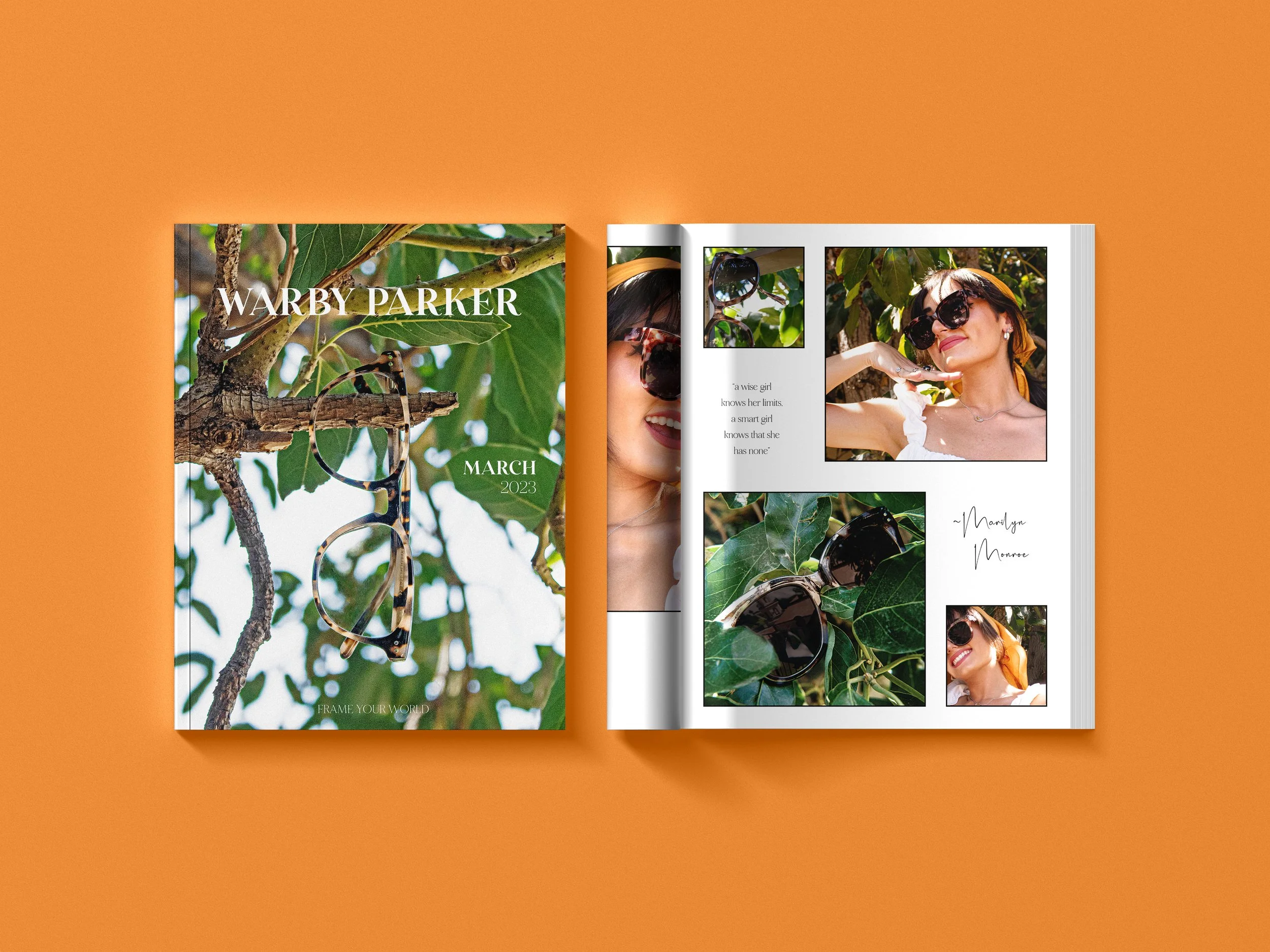
warby parker //
a promo campaign
The Warby Parker promo campaign focused around exploring a new seasonal look for the glasses company and working with both product showcase and model cooperation to fully embrace the chosen vision. For this campaign, I focused towards the concept of modern content creators being a source of product placement and product sales, as well as considering a specific season for the catalog in which individuals could be shown off as much as the product itself. I chose to do a March 2023 Campaign, focused around National Women’s Month and women within the stylistic sphere. I had five ladies to represent content creators to show off the Warby Parker product while maintaining the style of the catalog itself to be especially simple and mimic the design of particular social platforms.
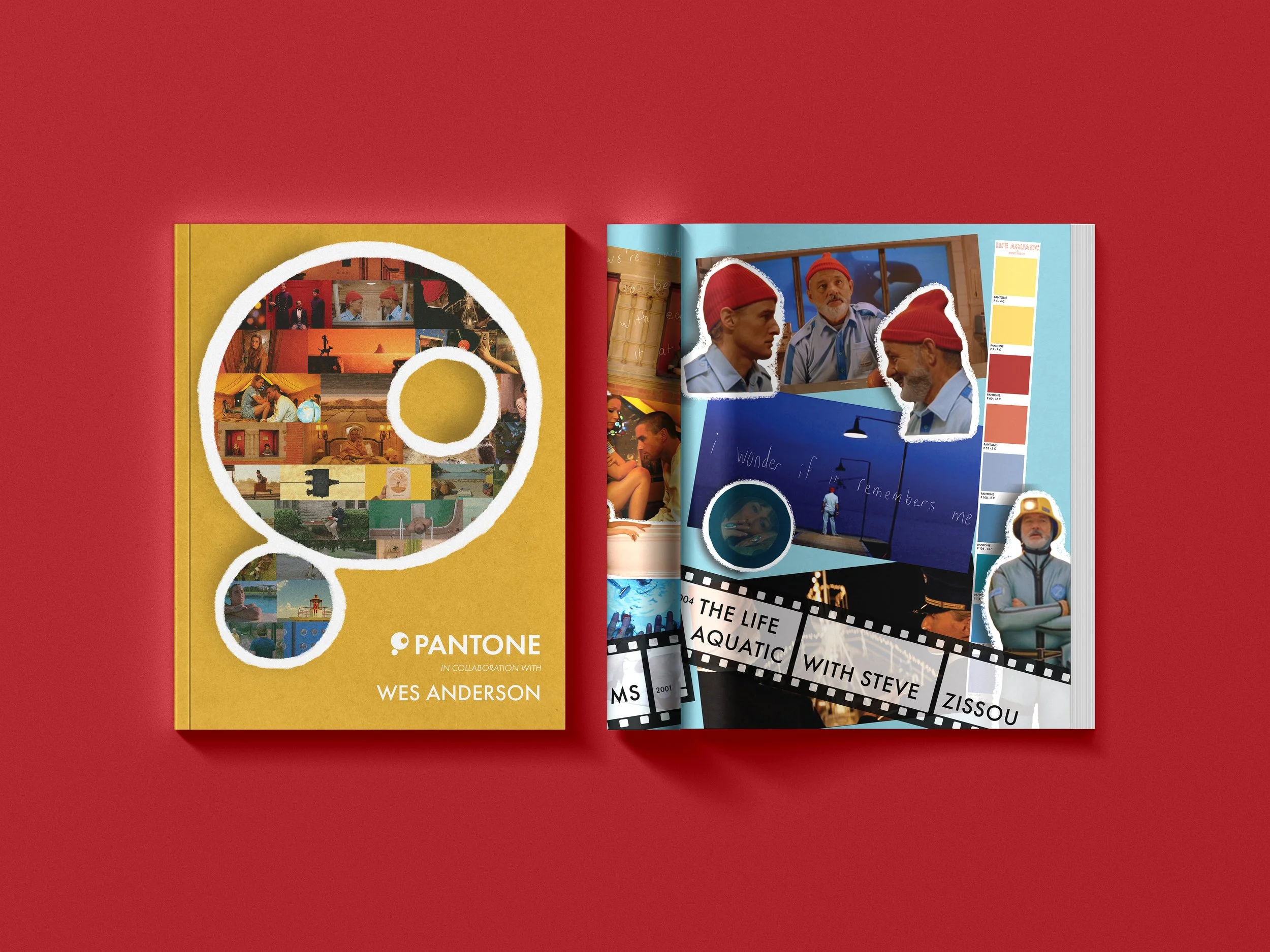
pantone x wes anderson //
a collaboration